[](https://github.com/mrpmorris/blazor-university/tree/master/src/TemplatedComponents/CreatingATabControl)
Next we'll create a `TabControl` component. This will teach you how to achieve the following goals:
1. Pass data into a `RenderFragment` to give it context.
2. Use a `CascadingParameter` to pass the parent `TabControl` component into its child `TabPage` components.
## Making the TabPage aware of its parent
The first step is to create two components.
One named `TabControl` and the other named `TabPage`.
The `TabPage` component will need a reference to its parent `TabControl`,
this will be achieved by the `TabControl` setting itself as the value in a `CascadingValue`,
and the `TabPage` will pick this value up via a `CascadingParameter`.
```razor
This is a TabControl
@ChildContent
@code {
// Next line is needed so we are able to add components inside
[Parameter]
public RenderFragment? ChildContent { get; set; }
}
```
```razor
This is a TabPage
@ChildContent
@code {
[CascadingParameter]
private TabControl? Parent { get; set; }
[Parameter]
public RenderFragment? ChildContent { get; set; }
protected override void OnInitialized()
{
if (Parent == null)
throw new ArgumentNullException(nameof(Parent), "TabPage must exist within a TabControl");
base.OnInitialized();
}
}
```
## Making the TabControl aware of its pages
Alter the `TabPage` component so it notifies its parent of its existence by adding the following line to the end of its `OnInitialized`
method.
```razor
Parent.AddPage(this);
```
Alter the `TabControl` component to add the `AddPage` method and store the reference. Also, let's add an `ActivePage` property.
```razor
public TabPage ActivePage { get; set; }
List Pages = new List();
internal void AddPage(TabPage tabPage)
{
Pages.Add(tabPage);
if (Pages.Count == 1)
ActivePage = tabPage;
StateHasChanged();
}
```
## Rendering a tab for each TabPage
Add a Text parameter to the `TabPage` component,
so its parent `TabControl` knows what text to show inside the button that activates each page.
```razor
[Parameter]
public string Text { get; set; }
```
And then add the following mark-up to `TabControl`
(just above where the `ChildContent` is rendered) which will both render the tabs,
and change which `TabPage` is selected when its tab is clicked.
```razor
@foreach (TabPage tabPage in Pages)
{
}
```
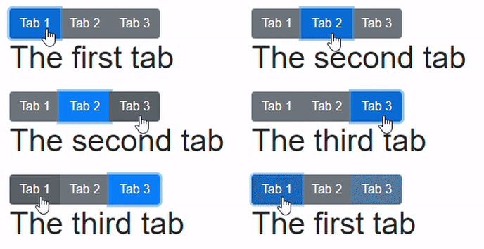
The mark-up will create a standard Bootstrap button group,
and then for each `TabPage` it creates a button with the following notable features:
1. The CSS class is set to "btn", appended by whatever the `GetButtonClass` method returns.
This will be "btn-primary" if the tab is the `ActivePage`, or "btn-secondary" if it is not.
2. When the button is clicked it will activate the page the button was created for.
**Note**: `@onclick` requires a parameterless method,
so a lambda expression is used inside `@( )` to execute `ActivatePage` with the correct `TabPage`.
3. The text of the button is set to the value of the `Text` property of the `TabPage`.
And add the following to the `TabControl`'s code section.
```razor
string GetButtonClass(TabPage page)
{
return page == ActivePage ? "btn-primary" : "btn-secondary";
}
void ActivatePage(TabPage page)
{
ActivePage = page;
}
```
## Using the TabControl
Add the following mark-up to a page and run the application.
```razor
The first tab
The second tab
The third tab
```
## Showing only the active page
At the moment the `TabControl` will show all `TabPages`.
To fix this, simply change the mark-up in `TabPage` so it only renders its `ChildContent` if it is the `ActivePage` of its
parent `TabControl`.
```razor
@if (Parent.ActivePage == this)
{
@ChildContent
}
```
## A note on render modes and prerendering
When using InteractiveServer or InteractiveWebAssembly render modes, a component may be prerendered on the server before the interactive session begins. During prerendering, `OnInitialized` is called once on the server and then again once the interactive runtime is established. If your `TabPage` or `TabControl` performs side-effects in `OnInitialized` (such as registering pages), be aware that these effects may execute twice. In practice, the second call typically replaces the earlier state, so the component works correctly; but it is worth knowing about if you see duplicate registrations during development.
## Accessibility basics
For a production tab control, consider adding WAI-ARIA attributes to improve accessibility. At a minimum, give the tab list a `role="tablist"`, each tab button `role="tab"`, and each content panel `role="tabpanel"` with matching `aria-labelledby` and `id` references. The `aria-selected` attribute on the active tab button also helps screen readers. Blazor makes this straightforward by binding these attributes in your render logic.
## Next steps
Now that we have a working `TabControl`, the next page explores [passing data to a RenderFragment](/templating-components-with-renderfragements/passing-data-to-a-renderfragement/) so consumers can customise how each tab's button is rendered.
Hire [Peter Morris](mailto:mrpmorris@gmail.com) for Blazor and C# work - author of Blazor-University.com, the definitive source for Blazor.