[](https://github.com/mrpmorris/blazor-university/tree/master/src/TemplatedComponents/TemplatedComponents)
So far we've created components that generate 100% of their rendered output based on parameters, but components aren't always that simple. Sometimes we need to create components that mix consumer-supplied mark-up with their own rendered output.
It would be very messy (not to mention unmanageable) to pass content to a component as an HTML encoded string parameter:
```razor
```
And, in addition to the maintenance nightmare, the embedded HTML could only be basic HTML mark-up too, no Blazor components. Basically, it'd be useless, and obviously that's not how it should be done. The correct approach is to use a `RenderFragment`.
## Child content
If we create a new component named Collapsible (a completely empty .razor file) we can, as you have already seen, consume that in the `Index.razor` page, like so:
```razor
```
But what if we want to embed some content? Give it a try and then look at the error in your browser's console output.
```razor
Hello world!
```
> WASM: System.InvalidOperationException: Object of type 'TemplatedComponents.Components.Collapsible' does not have a property matching the name 'ChildContent'.
>
> Error output when trying to embed content in a component not designed to expect it
## The RenderFragment class
Now change the `Collapsible` component so that it has a property named `ChildContent`, a type of `RenderFragment`, and make sure it is decorated with a `[Parameter]` attribute.
```razor
@code {
[Parameter]
public RenderFragment ChildContent { get; set; }
}
```
These are the criteria Blazor uses to inject embedded content into a component. The embedded content may be anything you wish; plain text, HTML elements, more razor mark-up (including more components), and the content of that embedded content may be output anywhere in your component's mark-up simply by adding `@ChildContent`.
```razor
@code
{
[Parameter]
public RenderFragment ChildContent { get; set; }
[Parameter]
public bool Collapsed { get; set; }
string ActionText { get => Collapsed ? "Expand" : "Collapse"; }
void Toggle()
{
Collapsed = !Collapsed;
}
}
```
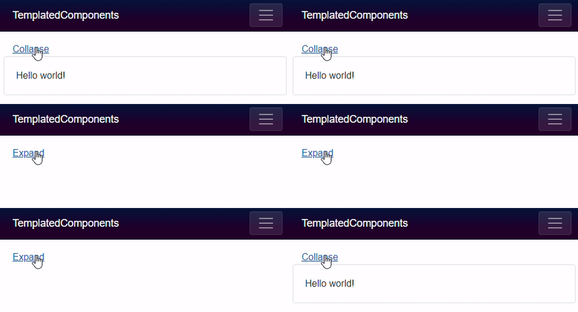
## Multiple render fragments
When we write mark-up inside a component, Blazor will assume it should be assigned to a Parameter on the component that is descended from the `RenderFragment` class and is named `ChildContent`. If we wish to use a different name, or multiple render fragments, then we must explicitly specify the parameter's name in our mark-up.
```razor
The header
The ChildContent render fragment must now be explicitly named because we have
more than one render fragment parameter in MyComponent.
It doesn't have to be named ChildContent.
```
In the preceding example we only need to explicitly specify `` because we have explicitly used one or more other render fragments (`Header` and `Footer`). If we don't want to specify a `` and a `